Case Study: Website Design & Monthly Content Marketing for Landscape Design/Build in Long Island, NY
Above All Masonry Design, based out of Islip, NY, is a landscape design and build company. After many years of being in business, Above All needed to take their brand to the next level of sophistication to appeal to their new target market. And of course, they needed to be found online by these target customers.
The Challenge
Above All had an existing SEO strategy that involved content marketing. They had a Facebook account, Houzz profile, good looking website, and they had new monthly content pages built on their website, some were even blog pages (and for anyone that knows us here at Halstead Media, you'll know we stand behind content as SEO).
They were doing many of the essential puzzle pieces that you would expect to see in a successful landscaping company. So what exactly was wrong? Above All was appealing to the wrong target market. After being in business for over ten years, the owners found a niche they were passionate about and they wanted to work with people that were about passionate about the design and installation techniques, styles, and cost.
Related Blog Post: Not all Blogs Are Made the Same
How We Helped
Halstead Media started with an upgraded content strategy first. Beginning around April 2016, we carefully researched the keywords their current website was optimized and compared it to the desired keywords (which we identified using keyword analyzing tools combined with the services Above All wanted to design/build). From there, and then monthly, we created blog content geared to those keywords and of course, locations. Locations were chosen primarily by desired service locations combined with population and average household income.
A few months later, the results were in. Above All was ranking for keywords in cities that were important. The results? 16% increase in traffic, year-over-year, for the same time period. All along, these posts were shared on Facebook and emailed to subscribers.
Now it was time to prepare for the website's transformation. Starting with the logo design, we gave Above All the new, sophisticated look & feel. Staying close to the original colors, we maintained circle in the previous logo. The final logo is elegant, professional, and high-end.
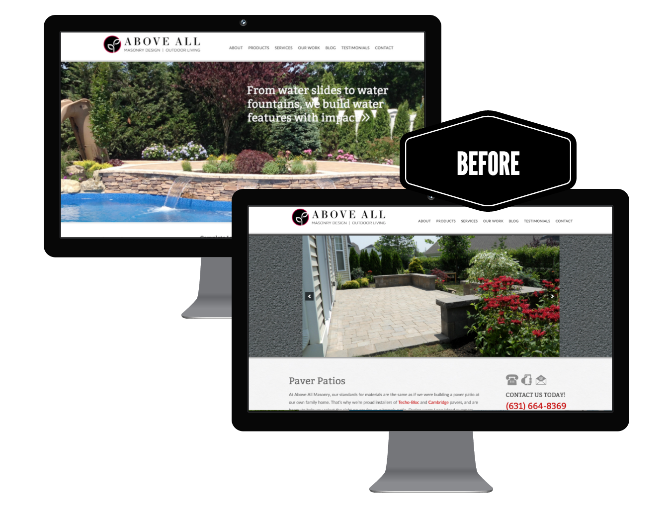
As for the website, the final new look for this design/build company is now revealed. The new websites represents the company’s now higher-end design and installation style. The projects are no longer lacking proper organization (projects were previously categorized by city rather than by type). A consistent sidebar which felt intrusive on pages in which a contact form in the sidebar was unnecessary is now gone. Fonts, colors, and text all represents the higher-end quality work that Above All is passionate about.
Words from Above All Masonry....
“Working with Anna and Corey has been an amazing experience. They are the piece of the puzzle our company was missing. They have transformed our website, and social media to now represent how our company has evolved. They truly have captured the elegant high end design we were looking for. We are getting an overwhelming amount of positive feedback from new and exciting customers.
Their marketing advice is such an important part of their service to us. They are always available to discuss and brainstorm guiding us in the best direction. Every new project they do for us exceeds our expectations. We are excited for the work we will be doing together with them in the future. We highly recommend them.”


